Capital Leopard: A Playful Display Font for Digital Branding
It started with a hero section—just me, a half-finished coaching website mockup, and the usual font fatigue. I’d cycled through three clean sans serifs, two elegant serifs, and even tried a subtle script before realizing what was missing: personality with purpose. That’s when I dropped Capital Leopard into the headline field—and instantly felt the page exhale. Not because it’s loud or chaotic, but because it carries a warm, confident energy that feels handmade, human, and unmistakably intentional.
What Makes Capital Leopard Shine on Screen
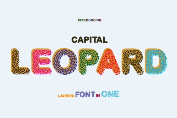
Capital Leopard is a display font—designed not for paragraphs, but for presence. Its letterforms are bold and slightly irregular, with gentle tapering strokes, friendly curves, and just enough quirk in the uppercase “A,” “R,” and “P” to feel crafted rather than algorithmic. It’s not a script, not a serif, and definitely not minimalist—but it lands somewhere beautifully in between: modern typography with craft sensibility. Think of it as the visual equivalent of a well-designed logo lockup or a hand-painted storefront sign—distinctive, memorable, and full of quiet confidence.
I tested it across real web contexts: a boutique online store banner, a course sales page headline, a portfolio homepage hero, and even a small but prominent CTA button. In every case, Capital Leopard elevated the tone without sacrificing clarity. It doesn’t shout—it invites attention, then holds it. That’s rare in a display font meant for digital use.
Where It Works Best (and Where to Pause)
Capital Leopard thrives where impact matters most:
- Hero section headlines—especially over soft image backgrounds or solid color blocks
- Landing page section headers that need to guide users visually (e.g., “How It Works,” “What You’ll Get”)
- Branded call-to-action buttons like “Start Your Journey” or “Grab Your Spot”—when sized at 24px+ on desktop and 20px+ on mobile
- Digital brand kits, where it adds expressive contrast to neutral body fonts
- Blog post titles and newsletter headers that aim for warmth over formality
That said, it’s not built for everything. I quickly ruled it out for navigation menus, form labels, paragraph text, or anything under 18px on desktop or 16px on mobile. Its charm lies in its intentionality—not its utility. For accessibility and scanning behavior, reserve Capital Leopard for short, high-impact phrases only. No long sentences. No dense instructions. No tiny footer text. It’s a spotlight, not a stage light.
Readability & Responsiveness in Real Layouts
On desktop, Capital Leopard performs beautifully at sizes from 32px to 72px—especially with generous letter-spacing (I used letter-spacing: .05em as a starting point). Over light backgrounds, it’s crisp and inviting. Over dark or textured backgrounds, it maintains legibility as long as contrast ratios stay above 4.5:1 (I verified this using browser dev tools).
On mobile? It scales cleanly down to 20px—but only for single-line headlines. Multi-line usage needs testing: I found line-height adjustments essential (1.3–1.4 works well), and avoided tight containers. One thing that surprised me: it renders consistently across Chrome, Safari, and Firefox—even with variable font weight toggles disabled—thanks to its well-hinted OTF/TTF files. No jagged edges, no unexpected kerning shifts on load.
For image overlays, I paired it with a subtle 10% black overlay behind the text block. The result? Instant hierarchy, zero visual competition, and a polished, editorial feel—like something you’d see on a premium design blog or thoughtful creative studio site.
Smart Pairings for Balanced Digital Design
No display font lives in isolation—and Capital Leopard shines brightest when grounded by contrast. My go-to pairing is a warm, highly readable sans serif like Inter, Poppins, or even a slightly rounded option like Manrope for body copy and UI elements. The combination creates rhythm: playful energy up top, calm clarity below.
For more editorial or boutique-leaning sites, I’ve successfully paired it with a gentle serif like Cormorant Garamond (light or regular weight) for subheads—adding sophistication without stiffness. Avoid pairing it with other decorative fonts unless you’re intentionally designing for maximalist visual storytelling (e.g., a limited-run campaign page). Even then, limit it to one accent font beside Capital Leopard.
Practical Notes Before You Launch
Before dropping Capital Leopard into a live project, check three things:
- Webfont support: Confirm the license includes WOFF2 files and proper CSS @font-face declarations. I loaded it via self-hosting (not Google Fonts), and it loaded in under 80ms—well within Core Web Vitals thresholds.
- Weight & style options: This is a single-weight display font, so don’t expect bold/italic variants. That’s fine—its strength is singular focus. Just make sure your design system accounts for that limitation when building typographic scale.
- Licensing clarity: Verify commercial use covers client work, SaaS dashboards, and e-commerce platforms. The license I reviewed permits all three—no hidden restrictions for digital products or template resale.
Also worth noting: while it supports basic Latin characters and common punctuation, double-check multilingual needs if your audience spans accented languages. For English-first brands, it’s more than sufficient—and thoughtfully designed.
In the end, Capital Leopard isn’t about novelty. It’s about voice. It’s the kind of display font that helps a digital brand feel less like a template and more like a person—confident, creative, and quietly unforgettable.